5Feb |
Fresh Spring Color Palettes for Weddings and PartiesOn Trend, Southern Events Products, Trends and Inspiration |
Spring events invite color back into the conversation. After months of deeper tones and cozy textures, spring opens the door to palettes that feel lighter, brighter, and more expressive. A thoughtful spring color palette does more than set the mood. It influences how tables photograph and how cohesive the overall design feels. Below are spring color directions we’re seeing resonate right now, along with ideas for translating each palette into a polished, intentional event design.
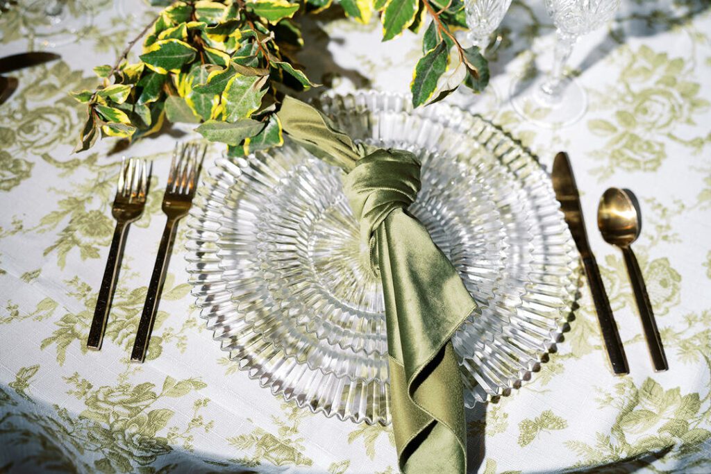
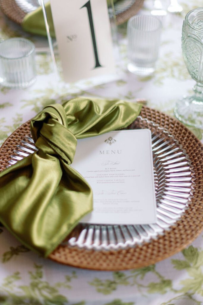
Green and Lime: Fresh, Playful, and Unexpected
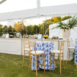
Green continues to be a spring favorite, but this season it’s showing up with a brighter twist. Classic greens like pistachio paired with a punch of lime or yellow feel energetic without being overpowering. This palette works especially well for outdoor events, garden-inspired parties, or modern spring celebrations that want a little personality.
On the tabletop, Gwyneth Glass Charger and China provide a clean, modern base, while Gold Tabletop Cordless Lamps add warmth and glow as the light shifts throughout the event. For linens, you can layer Lime Pindot or Pistachio Satin napkins over a softer foundation like Cornsilk Poly. Or, fully commit to a bold look by carrying the brighter tones across the entire table.
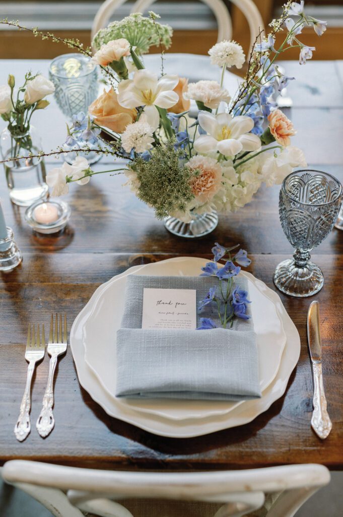
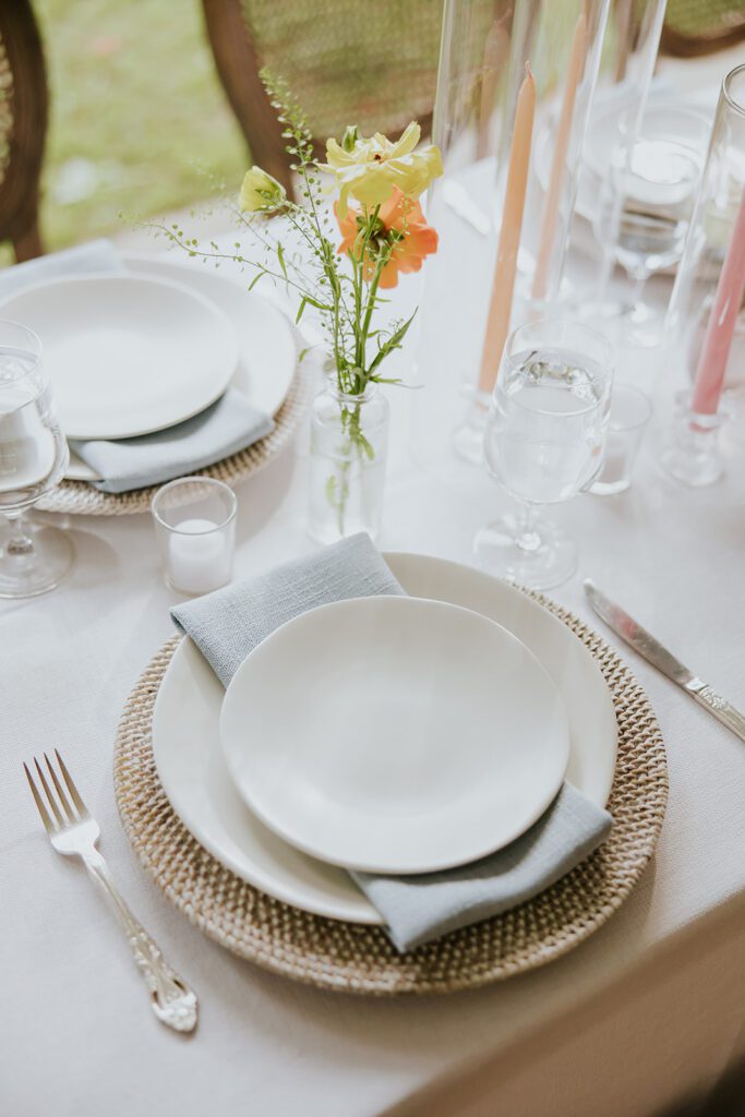
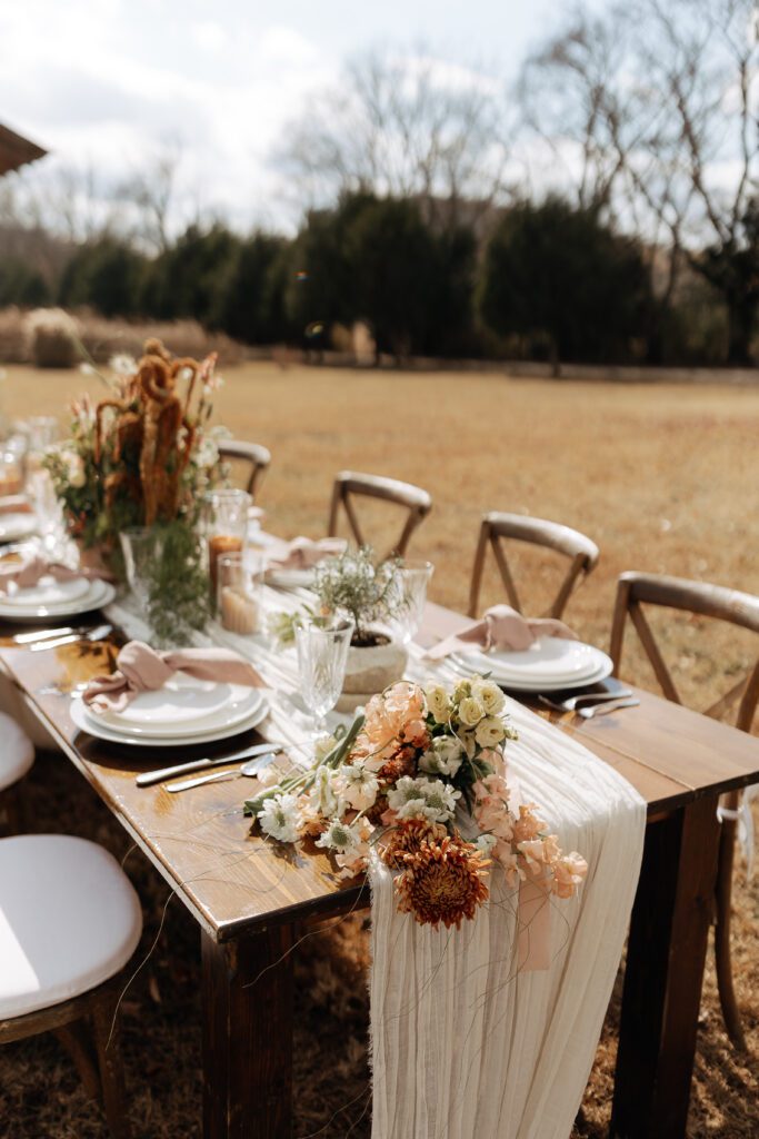
Soft Pastels with a Grounded Base
Soft pastels remain a staple of spring wedding colors, but the most current approach balances them with neutral textures and classic materials. Rather than leaning fully sweet, these palettes feel elevated and intentional.
A tablescape built with Alabaster Earthen China and Rattan Chargers creates a warm, organic foundation that pairs beautifully with pastel accents. Costa Napkins in Cornflower or Blush add gentle color without overwhelming the table, while Bella Glassware in Smoke or Blue introduces just enough variation to keep things interesting.
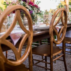
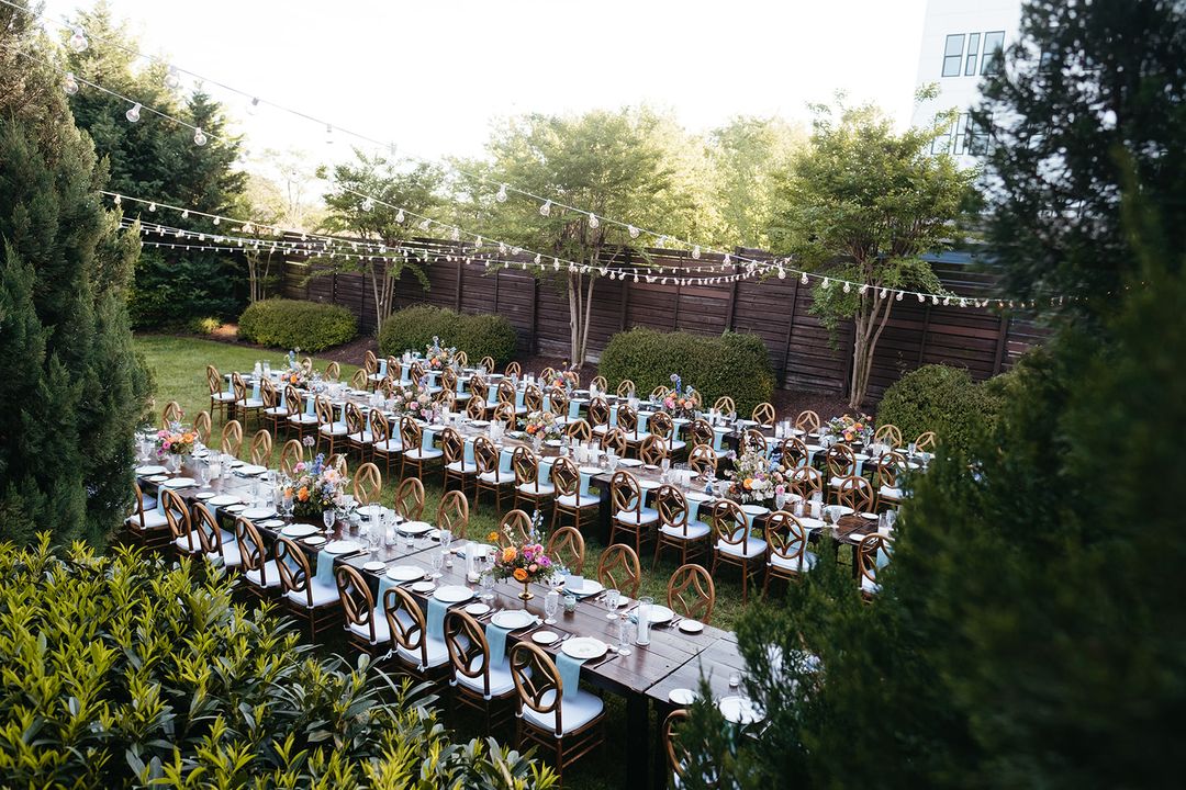
For seating, Antique White Bentwood Chairs or the more refined Harlin Dining Chairs complement this palette effortlessly. This combination works well for daytime weddings, spring brunches, and events where florals take center stage.
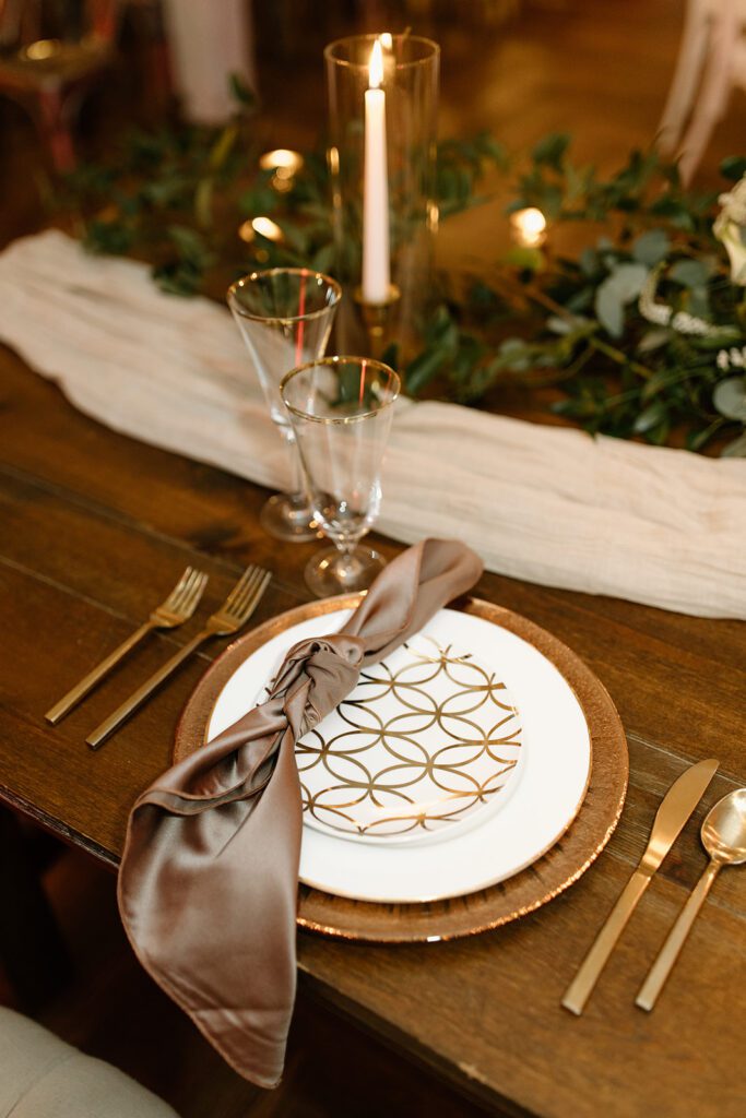
Tonal Browns: Elegant, Warm, and Timeless
Spring palettes don’t always have to be light or floral. Tonal browns layered with white and cream create a sophisticated look that feels grounded and modern, especially for clients drawn to understated elegance.
This palette comes together beautifully with Chocolate Poly Linens paired with Natural Costa Nova Napkins, creating depth through tone rather than contrast. On the tabletop, Welles Wheat China and Monaco Cut Crystal Glassware elevate the look, while Kendall Champagne Flatware adds a subtle metallic accent. For added contrast and a slightly editorial edge, Black Willow Chairs bring definition to the space without overpowering the palette. This approach is ideal for evening spring events or venues with architectural character.
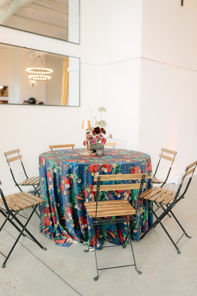
Bold and Print-Forward: Color Without Apology
For hosts who love making a statement, spring is the perfect season to embrace bold color and pattern. Rich tones layered together feel intentional when the palette is cohesive, even when it’s expressive.
A standout option is pairing a dramatic Regalia Velvet with Heritage Red Cranberry Napkins and Blue Meridian Tumblers. This combination feels vibrant and luxurious, especially when styled alongside large-scale floral installations in deep greens and saturated blooms. To balance the richness, Welles Blue China with gold accents adds polish and structure. This palette works best when leaned into fully, creating a high-impact look that feels curated rather than chaotic.
Bringing Spring Color Palettes to Life
No matter which direction you choose, the most successful spring palettes rely on layering. Color, texture, and material should work together to tell a cohesive story. Florals can enhance the palette rather than define it, while linens, tabletop pieces, and furniture help anchor the design.
At Southern Events, we help clients translate inspiration into real-world design, using rentals to support the palette rather than distract from it. Whether your spring celebration leans fresh and playful or bold and expressive, a thoughtful spring color palette sets the stage for a memorable event. If you’d like help refining your palette or selecting rentals that bring it to life, our team is always happy to guide the process. Reach out today!
FEATURED RENTALS | Gwyneth glass charger, gold tabletop cordless lamps, pistachio satin linens, lime pinot linens, cornsilk poly, alabaster earthen china, rattan chargers, costa napkins, Bella glassware, antique white bentwood chairs, harlin dining chairs, chocolate poly linens, Monaco cut crystal glassware, Kendall champagne flatware, Welles wheat china, black willow chairs, regalia velvet, heritage red cranberry, blue meridian tumblers, Welles blue china,
SEE MORE LIKE THIS